Most business websites share the same quiet problem: they attract traffic, but that traffic leaves without doing anything. No enquiry. No purchase. No sign-up. Just a bounce.
This is rarely a content problem. It is not even usually a design problem in the visual sense. More often, it is a structural one. The website has no clear path guiding visitors from arrival to action. There is no logical sequence, no deliberate momentum, and no sense that the site knows where it wants the visitor to go next.
That is precisely what a well-designed website sales funnel solves. And it is why every serious business website — regardless of size, industry, or budget — needs one built into its architecture from the ground up.
This article explains what a website sales funnel is, why most websites fail without one, how to design each stage effectively, and what common mistakes to avoid. Whether you are launching a new site or rethinking an existing one, the principles here will help you build a website that does not just exist — it performs.
What Is a Website Sales Funnel?
A website sales funnel is the deliberate sequence of steps a visitor moves through on your site, from first discovering your brand to taking a meaningful action — making a purchase, submitting an enquiry, or booking a consultation.
The term “funnel” is intentional. At the top, you have a broad pool of visitors with varying levels of awareness and intent. As they move through the funnel, some drop off at each stage, and those who remain are increasingly engaged and increasingly close to converting. The goal of good funnel design is to maximise the number of people who make it through each stage — and to make that progression feel natural, not forced.
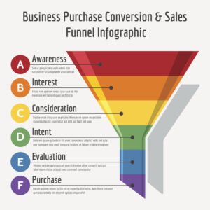
The classic model follows four stages:
Awareness — The visitor discovers your website for the first time, usually through a search engine, social media, a referral, or a paid ad. At this point they may know very little about your brand. Their attention is fragile and their patience is short.
Interest — Having decided your site is worth exploring, the visitor begins looking more closely at what you offer. They are asking: does this business understand my problem? Do their services seem relevant to me?
Decision — The visitor is now actively considering whether to act. They are comparing options, reading testimonials, studying your service pages, and quietly asking themselves whether they trust you enough to reach out.
Action — The visitor takes the step you want them to take. They fill in the contact form, click the booking link, make the purchase, or pick up the phone.
A strong funnel does not leave this journey to chance. Every page, every heading, every image, and every call to action is placed with intention — designed to move visitors forward, not leave them wondering what to do next.
Why Most Websites Fail at Converting
Understanding why websites fail is just as important as understanding what a funnel is. Thousands of businesses invest in professionally designed websites every year and still find that those sites generate very little in the way of leads or sales. The reasons are almost always the same.
There is no clear direction. When a homepage tries to say everything at once — listing every service, promoting multiple offers, and speaking to three different audiences simultaneously — visitors absorb nothing. The human brain is not designed to process decision paralysis well. When there is no single, focused message and no obvious next step, visitors take the path of least resistance: they leave.
Calls to action are weak or absent. A call to action that reads “Click here” or “Learn more” with no surrounding context gives visitors no compelling reason to act. Effective CTAs communicate what the visitor will receive, not just what they should do. They also need to be placed at the right moments — when the visitor’s interest and intent are at their peak, not buried in a footer or tacked on as an afterthought.
The layout is confusing. If a user cannot intuitively understand what a business does within the first few seconds of landing on a page, they will not stay long enough to become a customer. Navigation menus with too many items, pages with competing visual hierarchies, and content that buries the most important information — all of these create friction that kills conversions before they ever begin.
There is no consideration for the user journey. Many websites are built page by page, with each page designed in relative isolation. The homepage is designed. The about page is designed. The services page is designed. But no one has sat down and asked: how does a visitor naturally move between these pages? What are they thinking and feeling at each stage? What do they need to see before they are ready to act? Without answers to these questions, a website is a collection of well-designed pages rather than a coherent, converting system.
These are structural design problems. They require structural design solutions — and that is the core discipline behind a properly engineered website sales funnel.
The 4 Key Stages of a High-Converting Funnel
1. Capture Attention — Homepage and Landing Pages
The top of your funnel is where first impressions are formed, and where the vast majority of visitors will make their initial decision about whether to stay or leave. Research consistently shows that users form an opinion about a website within the first few seconds of arrival. That window is not long enough to read a paragraph — it is barely enough to register a headline.
This means your homepage or landing page needs to communicate three things almost instantly: who you are, what you do, and why it matters to this specific visitor. A strong, benefit-led headline does the heavy lifting. A supporting subheading adds clarity. A clear value proposition answers the question “why you?” And an immediate, well-placed CTA invites the visitor to take the next step before they lose momentum.
Everything else on this page — imagery, layout, spacing, colour — should serve these goals. Aesthetic choices matter enormously here, but they should never overshadow function. A homepage that looks beautiful but fails to communicate quickly is a liability, not an asset.
For businesses running specific campaigns — a product launch, a seasonal offer, a targeted service — a dedicated landing page will almost always outperform the homepage as a conversion tool. Landing pages are stripped of distraction, built around a single audience and a single goal, and structured specifically to guide that visitor from arrival to action without detour. They are one of the most effective tools available within a website funnel for lead generation, precisely because they eliminate the noise that general pages inevitably carry.
2. Build Trust — About Page, Testimonials and Social Proof
Once a visitor has decided your site is worth exploring, they enter the interest stage. Now they need reasons to believe you. This is where social proof becomes one of the most powerful conversion tools at your disposal.
Client testimonials, case studies, industry accreditations, recognisable client logos, and an honest, human About page all serve the same purpose: they lower resistance. They answer the unspoken question every visitor is asking — can I trust these people with my problem and my money?
The quality of your social proof matters as much as its presence. A testimonial that says “Great service, highly recommend” is almost meaningless. A testimonial that says “We came to Bave Design Studio with a website that had zero conversions. Within three months of the redesign, our enquiry rate had doubled” — that is evidence. Specificity builds credibility in a way that general praise never can.
Your About page is also frequently underestimated as a funnel asset. For many small and medium businesses, visitors go to the About page specifically to decide whether they like and trust the people behind the brand. An About page that reads like a corporate brochure — full of mission statements and passive voice — will do nothing for conversions. One that communicates personality, values, experience, and genuine expertise will move people meaningfully closer to action.
Case studies are another underused trust mechanism. A well-structured case study — problem, approach, outcome — demonstrates not just that you can do the work, but that you understand the kind of challenge your prospective clients are facing. That recognition is powerful. When a visitor reads a case study and thinks “that sounds exactly like our situation,” you have cleared the largest psychological hurdle between interest and decision.
3. Offer Value — Services Pages and Content
By the time a visitor reaches this stage, they are in the decision phase. They are actively evaluating whether you are the right solution to their specific problem. Your services pages and content — blog posts, guides, case studies, FAQs — need to meet them at exactly this point.
Service pages that simply list what a business offers are a missed opportunity. A strong website conversion funnel strategy demands that service pages go further: they should name the problem the visitor is facing, explain why it matters, describe the solution in concrete and specific terms, and provide evidence that the solution works. Where appropriate, price transparency also reduces friction considerably — visitors who cannot get any sense of investment level will often move on rather than reaching out to ask.
Each service page should also function as a standalone funnel in miniature. A visitor arriving on a service page directly from a search engine may have skipped your homepage entirely. That page needs to stand on its own — communicating who you are, why you are credible, what you offer, and what the visitor should do next, all within a single, well-structured page.
Content plays a longer game in the funnel. A well-written blog post that answers a specific question can introduce a visitor to your brand at the awareness stage and build enough trust and authority that, when they are ready to make a decision weeks or months later, your business is the first one they consider. This is the sustained mechanism behind a high-performing website funnel for lead generation — you are creating multiple entry points into the funnel, not just relying on the homepage to do all the work. Over time, this compounds into a significant competitive advantage, particularly in markets where competitors are not investing in content.
4. Drive Action — Contact Page and Final CTAs
The bottom of the funnel — the action stage — is where everything either pays off or falls apart. A visitor who has made it this far is genuinely interested. They want to reach out. The only thing standing between them and a conversion is friction, and your job at this stage is to eliminate as much of it as possible.
Your contact page should be simple. A short form asking for name, email, and a brief description of the project is enough to begin a conversation. Every additional field you add reduces the likelihood of completion — and in most cases, the information collected from extra fields is not worth the conversions lost. A clear statement of what happens next — “We will respond within one business day” — removes uncertainty and reassures the visitor that reaching out is safe and worthwhile.
Final CTAs throughout the site should be consistent, specific, and placed at natural decision points — the end of a service page, after a testimonial, following a key piece of content. The language matters more than most businesses realise. “Get in Touch” is passive and offers no sense of what the visitor gets. “Start Your Project” or “Book a Free Discovery Call” communicates action, benefit, and low risk all at once.
At Bave Design Studio, the contact experience is treated as one of the most strategically important elements of any web project. A site can be beautifully designed, technically excellent, and full of compelling content — but if the final step is unclear, awkward, or buried, every visitor who made it that far is a lost opportunity.
Best Website Pages for a Conversion Funnel
Different pages serve different stages of the funnel. Understanding which pages carry the most weight — and designing them accordingly — is central to building a site that converts.
Homepage. The most visited page on most sites and the primary entry point for new visitors. It needs to orientate the visitor immediately, communicate your core value proposition, and direct them clearly to the next step in the journey. Everything on this page should be purposeful.
Landing Pages. Dedicated pages built for specific audiences or campaigns, stripped of everything that does not serve a single conversion goal. For businesses running paid advertising or targeted outreach, landing pages are among the highest-ROI investments available. They are the cornerstone of any effective website funnel for lead generation.
Service Pages. Where general interest becomes specific intent. Each service page is an opportunity to speak directly to a particular problem, demonstrate expertise, present evidence of results, and invite the visitor to take action. Businesses with multiple services should have a dedicated, well-developed page for each — not a single combined page that forces visitors to do their own filtering.
About Page. A genuine trust-builder that is frequently undervalued. When designed with conversion in mind, the About page can meaningfully move visitors from interest to decision by humanising the brand and establishing credibility at a personal level.
Blog and Content Pages. Long-form content that answers specific questions, positions your brand as a credible authority, and brings in visitors at the awareness stage who may not yet be ready to buy — but will be when the time comes.
Contact Page. The final step. It should feel like a natural, reassuring conclusion to the visitor’s journey — clean, simple, and free of any friction or uncertainty.
Common Funnel Design Mistakes
Even businesses that understand the theory of a website sales funnel can undermine it in execution. These are the most common mistakes worth actively avoiding.
Too many distractions. Navigation menus with eight or more links, multiple competing CTAs on a single page, pop-ups layered over banners, and sidebar widgets all fragment a visitor’s attention. Every unnecessary element you add to a page is a potential exit. Conversion-focused design is as much about what you remove as what you add.
Treating all pages as equal. Not every page in your site plays the same role in the funnel. Treating the contact page with the same design priorities as a blog post, or building a homepage without a clear conversion goal, dilutes the effectiveness of the entire system.
Ignoring mobile visitors. A significant and growing proportion of web traffic arrives on mobile devices. A funnel that works well on desktop but is clunky, slow, or difficult to navigate on a phone is losing a substantial portion of potential conversions before they even begin.
Generic CTAs. As noted earlier, the language of your calls to action has a direct impact on conversion rates. Generic, vague, or passive CTAs consistently underperform against specific, action-oriented, benefit-driven ones. This is one of the simplest improvements to make and one of the most frequently overlooked.
No clear user journey. A proper sales funnel for small business websites requires thinking about the visitor’s journey as a whole — not just individual pages in isolation. Where is the visitor coming from? What do they know when they arrive? What do they need to learn before they are ready to act? What is the single most important action you want them to take? These questions should inform every design and content decision on the site.
At Bave Design Studio, every website project begins with a funnel strategy and user journey mapping session. Before a single page is designed, we establish where each type of visitor enters the site, what they need at each stage, and how the design will guide them toward conversion. This ensures that the finished website is not just aesthetically strong — it is structurally built to perform.
Conclusion
A website that does not guide its visitors is a website that does not convert. The difference between a site that looks impressive and one that consistently generates leads and sales almost always comes down to whether a proper website sales funnel has been built into its design.
Every visitor who lands on your site is making a series of small decisions: do I stay? Do I explore? Do I trust this brand? Do I reach out? A well-designed funnel shapes each of those decisions with intention — creating a clear, logical, and persuasive path from awareness to action.
The good news is that this is entirely solvable. Whether you are building a new website from scratch or rethinking a site that has been underperforming, a conversion-focused approach to structure, content, and design can make a substantial difference — often without requiring a complete visual overhaul.
Good design is not decoration. It is direction.
Ready to turn your website into a lead-generating machine? Get in touch with Bave Design Studio to discuss a website audit or a full funnel-focused redesign. We build websites that are not just well-designed — they are built to convert.
Frequently Asked Questions
How many pages does a website funnel need?
At minimum, a homepage, a service or product page, and a contact page — though landing pages and blog content strengthen the funnel further.
Why is my website getting traffic but no conversions?
Most often the site lacks a clear user journey, has weak CTAs, or presents too many options at once.
Can a small business benefit from a website sales funnel?
Yes — even a three-page site can convert well if it is structured clearly and designed around the visitor’s journey.
How long does it take to see results from a funnel redesign?
Many businesses see measurable improvements within the first few weeks, with organic search gains compounding over two to three months.